By Russell Firestone
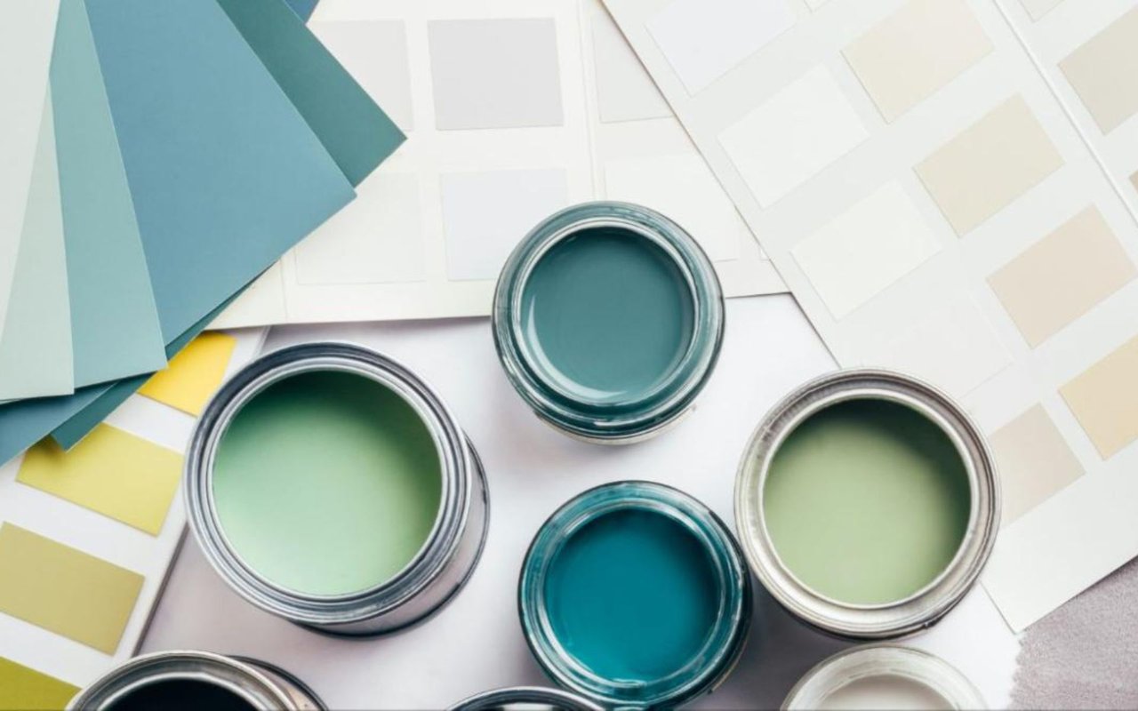
There is a reason that the first thing most staging professionals do before listing a home is repaint it. Color is one of the most powerful and immediate tools available to any homeowner, and yet it is also one of the most misunderstood. The colors you live with every day do not simply decorate your walls. They shape how you feel when you wake up in the morning, how energized or relaxed you feel in a given room, how large or intimate a space seems, and how buyers respond emotionally the moment they walk through your front door.
As someone who works in Washington, DC real estate and spends a great deal of time inside Georgetown and DC metro area homes, I have seen firsthand how transformative the right color choices can be, and how costly the wrong ones are to correct. This guide is designed to help you think about color with intention, whether you are refreshing your space for your own enjoyment, preparing for a sale, or simply trying to understand why certain rooms feel the way they do.
Key Takeaways
- Color psychology is the study of how colors affect human emotion, behavior, and perception, and it has direct practical applications for how you design your home
- Warm colors like red, orange, and yellow stimulate energy and appetite, making them well-suited for social spaces and dining rooms
- Cool colors like blue, green, and violet promote calm and focus, making them ideal for bedrooms, home offices, and bathrooms
- Neutral tones anchor luxury interiors and provide the visual flexibility that appeals most broadly to buyers in high-end markets like Georgetown
- Undertones matter as much as the color itself, and choosing the wrong undertone for your light conditions can undermine an otherwise strong palette
- Color choices in Georgetown and DC metro area homes should account for the architectural character of the property as well as current buyer expectations in the luxury market
What Color Psychology Actually Means for Your Home
Color psychology is not a design trend or a decorating philosophy. It is a well-documented field of study examining how different colors influence human emotion, cognition, and behavior. The implications for residential design are significant and practical. When you choose the color for a room, you are not simply making an aesthetic decision. You are making a decision about how that room will feel to anyone who spends time in it, including yourself, your family, and eventually your buyers.
The most important thing to understand is that color works on people whether they are aware of it or not. A buyer who walks into a dining room painted in a deep, saturated burgundy and feels immediately at ease probably cannot tell you why. A homeowner who finds it difficult to unwind in a bedroom painted in a bright, cool white may not connect that feeling to the color on the walls.
But the relationship is real, and designing your home with an understanding of that relationship puts you in a significantly stronger position, both as someone who lives in the space and as someone who will eventually sell it.
Warm Colors and Where They Work Best
Warm colors sit on the red, orange, and yellow side of the color wheel, and they share a common quality: they stimulate. Red raises energy levels and has been shown to increase heart rate and stimulate appetite. Orange carries much of red's warmth while softening the intensity, creating a convivial, welcoming feeling that translates beautifully into social spaces. Yellow in its softer, more muted expressions brings optimism and light into a room, particularly in spaces that receive limited natural sunlight.
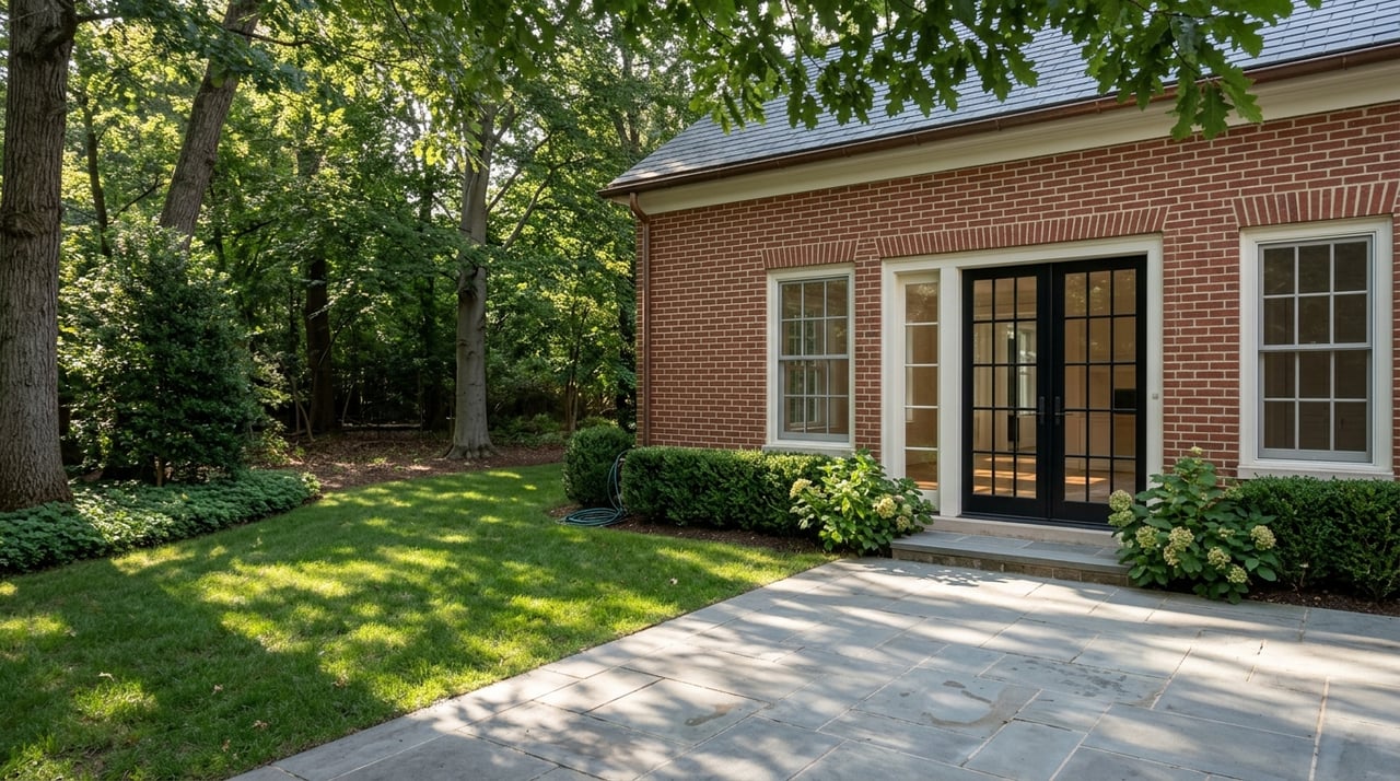
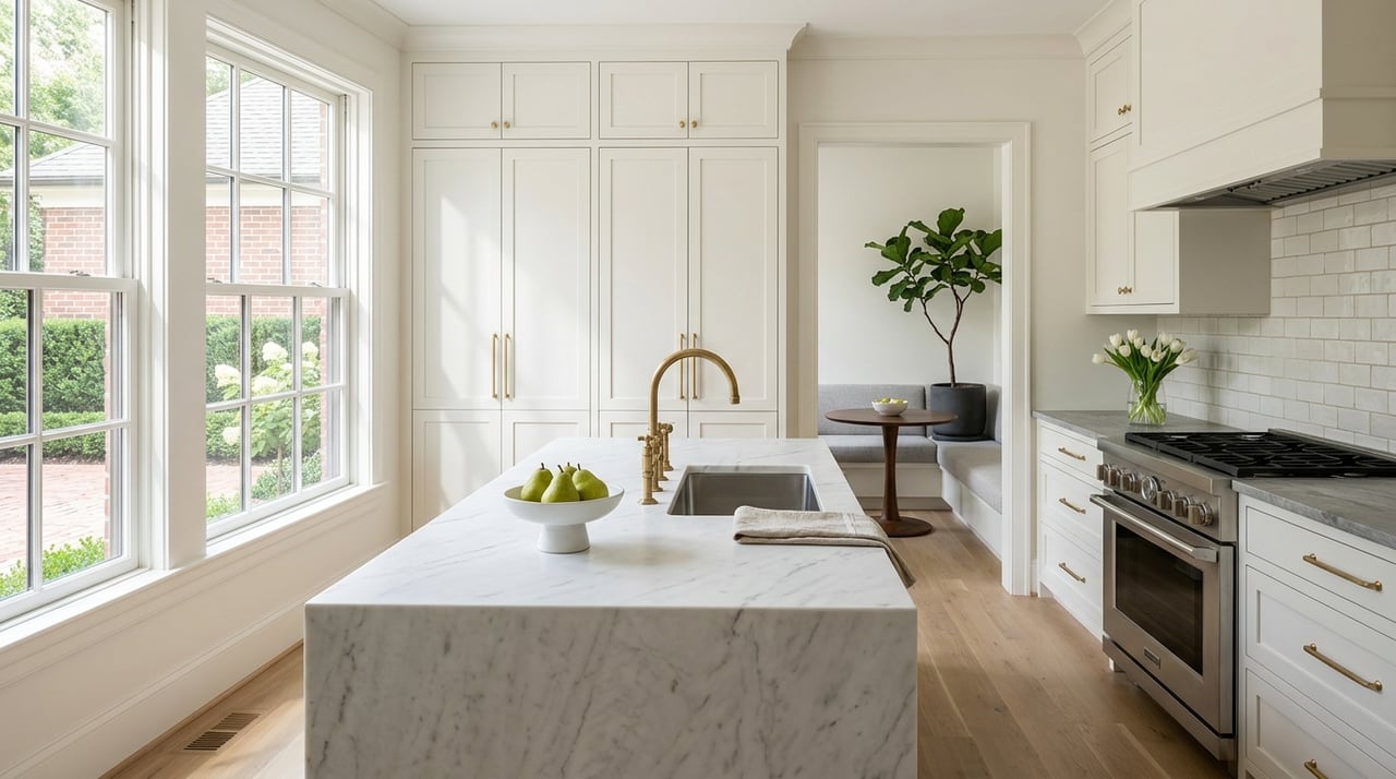
In a Georgetown row house or a DC metro area home with a formal dining room, a deep warm tone on the walls creates exactly the kind of intimate, enveloping atmosphere that makes dinner parties feel special. Think a rich terracotta, a muted saffron, or a classic Benjamin Moore Newburyport Red rather than a saturated primary. In kitchens, warm creamy whites and soft yellows support the energy of a cooking space without tipping into overstimulation.
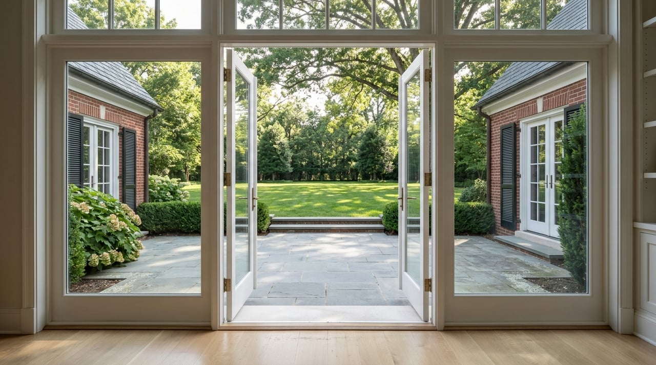
Entry halls painted in warm tones make an immediate impression and set a welcoming tone for everything that follows. The key with warm colors in high-end DC homes is saturation control. The most elegant warm palettes are layered and complex rather than bold and flat.
Cool Colors and the Spaces They Transform
Cool colors, including blues, greens, and soft violets, have the opposite effect of their warm counterparts. They slow the heart rate, reduce cortisol, and create a sense of calm that makes them ideally suited for bedrooms, bathrooms, and home offices. In the context of Washington, DC real estate, where buyers increasingly prioritize homes that offer genuine retreat from the pace of professional life, cool colors in the right spaces communicate something that goes beyond aesthetics. They signal sanctuary.
Navy and deep teal have become increasingly popular in Georgetown bedrooms and libraries precisely because they create a cocooning quality that feels both sophisticated and restful. Sage green works beautifully in bathrooms and primary suites, where its connection to the natural world adds an organic calm that white walls simply cannot replicate. Soft blue-grays in home offices support focus and concentration without the sterility of a cold, bright white.
For Georgetown homes with north-facing rooms that receive cooler, more diffused light, the right cool tone can feel beautifully moody and intentional rather than dim or unwelcoming. The secret is choosing cool colors with warm undertones to prevent them from reading as cold or clinical in lower light conditions.
The Strategic Power of Neutrals in Luxury Homes
In Georgetown and across the broader DC luxury real estate market, neutral palettes remain the most consistently effective choice for homeowners preparing to sell, and for good reason. Neutrals do not ask buyers to share a personal color preference. They provide a blank canvas that allows buyers to project their own vision onto a space, which makes emotional connection to the property significantly easier.
But not all neutrals are created equal, and this is where many homeowners go wrong. Flat, cool builder-grade whites feel institutional rather than luxurious. The neutrals that work best in high-end Georgetown homes are warm greiges, soft whites with creamy yellow or pink undertones, pale putties, and sophisticated off-whites that shift subtly with changing light throughout the day.
Farrow and Ball's Strong White, Benjamin Moore's White Dove, and Sherwin-Williams' Accessible Beige are perennial favorites among DC stagers and designers for exactly this reason. They feel elevated without demanding attention, and they photograph beautifully, which matters enormously in today's real estate market where the first showing almost always happens online.
Understanding Undertones and Light Conditions
One of the most common and frustrating color mistakes homeowners make is selecting a paint color in a store or on a screen and then finding that it looks entirely different on their walls. The reason is almost always undertones combined with the specific light conditions of the room. Every paint color, including every white and every neutral, carries an undertone of either warm or cool, and that undertone becomes much more visible once the color is on the wall and responding to the actual light in the space.
A room that receives strong southern or western light will warm up any color significantly. A room with northern or eastern exposure will pull out the cooler, bluer undertones in a paint color and make it read more starkly than it appeared on the chip. In Georgetown's older homes, where rooms may have single windows, original trim proportions, and ceiling heights that affect how light moves through the space, testing paint colors in large sample swatches and observing them at different times of day is not optional.
It is the single most important step in the color selection process, and skipping it almost always results in a repaint.
Color and Georgetown's Architectural Character
Georgetown homes are not a blank slate, and the color choices that work best in contemporary construction do not always translate to a Federal-era row house or a Victorian brownstone. The architectural character of your home should inform your color decisions as much as any psychological principle. Original trim colors, brick tones, hardwood floor warmth, and the proportions of rooms all create a context that your color palette needs to work with rather than against.
In Georgian and Federal-style Georgetown homes, historically informed palettes that reference the muted, complex colors of the period, dusty blues, aged whites, soft ochres, and deep greens, tend to feel most at home and most authentically luxurious. In more contemporary Georgetown properties or renovated interiors, there is more latitude for cleaner, more modern interpretations. The goal in either case is coherence: a palette where every color feels as though it belongs to the same world rather than a collection of independent decisions made room by room.
Frequently Asked Questions
What colors make a small Georgetown row house feel larger?
Light, cool neutrals with soft undertones tend to visually expand a space by reflecting more light and reducing visual weight. Painting walls, trim, and ceilings in closely related tones rather than contrasting colors also helps eliminate the visual interruptions that make rooms feel smaller and more compartmentalized.
Should I repaint my home before listing it for sale in Washington, DC?
In most cases, yes. Fresh paint in a well-chosen neutral palette is one of the highest-return investments a DC homeowner can make before listing. It makes a home photograph better, feel cleaner and more move-in ready, and appeal to the broadest possible pool of buyers.
Are there colors I should avoid in a Georgetown home?
Very saturated, trendy colors that reflect a specific personal taste rather than a broad sensibility tend to be the most challenging for buyers to overlook. Highly personalized color choices can make buyers feel like they are entering someone else's home rather than envisioning their own life in the space.
How do I choose between warm and cool neutrals for my home?
Start with the fixed elements in each room, including flooring, cabinetry, stone, and the undertones in your existing trim and architectural details. Warm-toned floors and wood elements generally pair better with warm neutrals, while cooler stone and more contemporary finishes support cooler white and gray palettes.
Does exterior color matter for a Georgetown home's value?
Absolutely. Georgetown's Old Georgetown Act governs exterior changes, and exterior color choices should complement the historic character of the home and the streetscape. A well-chosen exterior palette that honors the neighborhood's architectural context enhances curb appeal and buyer perception from the moment someone arrives at the property.
Ready to Talk About Your Home in Washington, DC?
Whether you are refreshing your current home, preparing for a sale, or searching for a property in Georgetown or anywhere across the DC metro area, the decisions you make about your space matter more than most people realize. Color is one of the most accessible and highest-impact tools available to any homeowner, and approaching it with intention rather than impulse consistently produces better results.
If you are thinking about buying or selling in Washington, DC, I would love to help you think through what your home needs and what the market is telling us right now. You can explore my work and connect directly today.